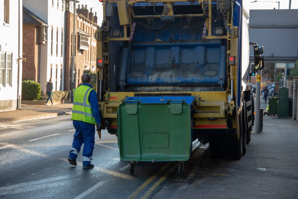
Case 350 – Eye bolt failure results in fatality
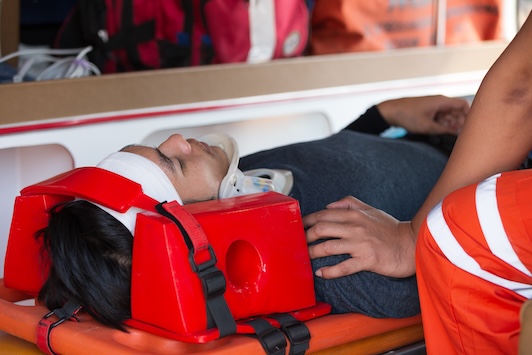
Two workers were injured, one fatally, when an eye bolt failed during an attempt to hoist a mould weighing about 29,500 kg (65,000 lbs.).
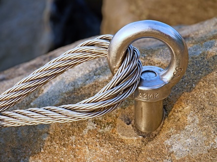
Eye bolts are used in rigging and hoisting of heavy equipment and parts, for example, in automotive manufacturing, in tool and die shops, and in manufacturing and installing heavy equipment. Shoulderless or ring bolts are used for vertical loading only; angle loading on shoulderless bolts will bend or break them.
In this case, four shoulderless eye bolts, 6.5 cm (2.5 inches) in diameter, had been screwed in close to the four corners of the mould. Four chains were hooked into the eye bolts and attached to the hook of an overhead travelling crane.
One eye bolt snapped before the mould lifted off the floor. The chain, with part of the eye bolt attached, swung up and struck the first worker, then hit the second as it came down.
This incident illustrates the need to follow these safety precautions:
• The manufacturer’s identification and the safe load-lifting capacity must be stamped onto all eye bolts to ensure safe use, as required by occupational health and safety regulations for industrial establishments.
• Shoulderless eye bolts should be used only where the hoist chain or sling is aligned with the axis of the bolt (so it pulls in exactly the same line as the length of the bolt). The bolt must be fully screwed into the load.
• Shouldered eye bolts must be used whenever the chain or sling is rigged at an angle from the axis of the bolt. When the eye bolt is screwed into the load, the shoulder must be at right angles to the axis of the hole tapped or drilled for the bolt and fit flat against the surface of the load.
• To make sure the eye bolt will not be bent sideways, the chain or sling must be in the plane of the eye. To ensure the shoulder is firmly seated on the surface of the load when the eye has been correctly aligned with the chain or sling, a metal washer of suitable size and shape may be used under the shoulder. As the angle between the chain or sling and the axis of the eye bolt increases, the available load-lifting capacity of the eye bolt is reduced from the stamped capacity.
For further precautions, refer to https://www.ccohs.ca/oshanswers/safety_haz/materials_handling/eye_bolts.html